Design
Entryway Furniture Piece Design
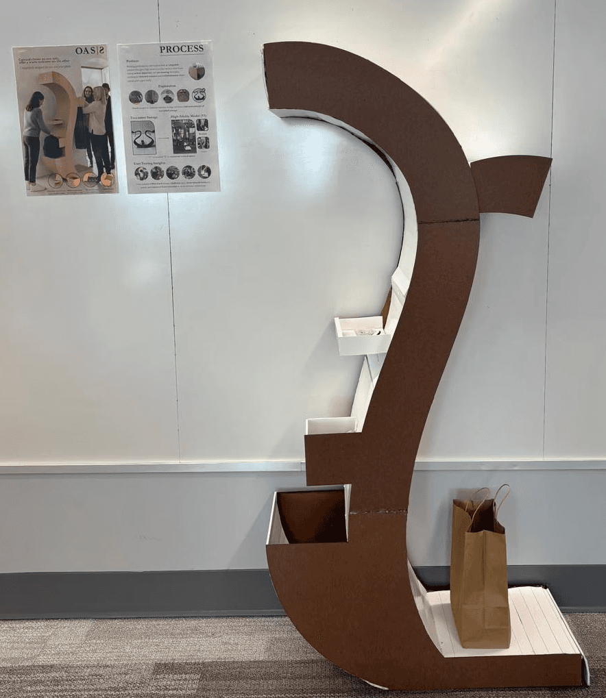
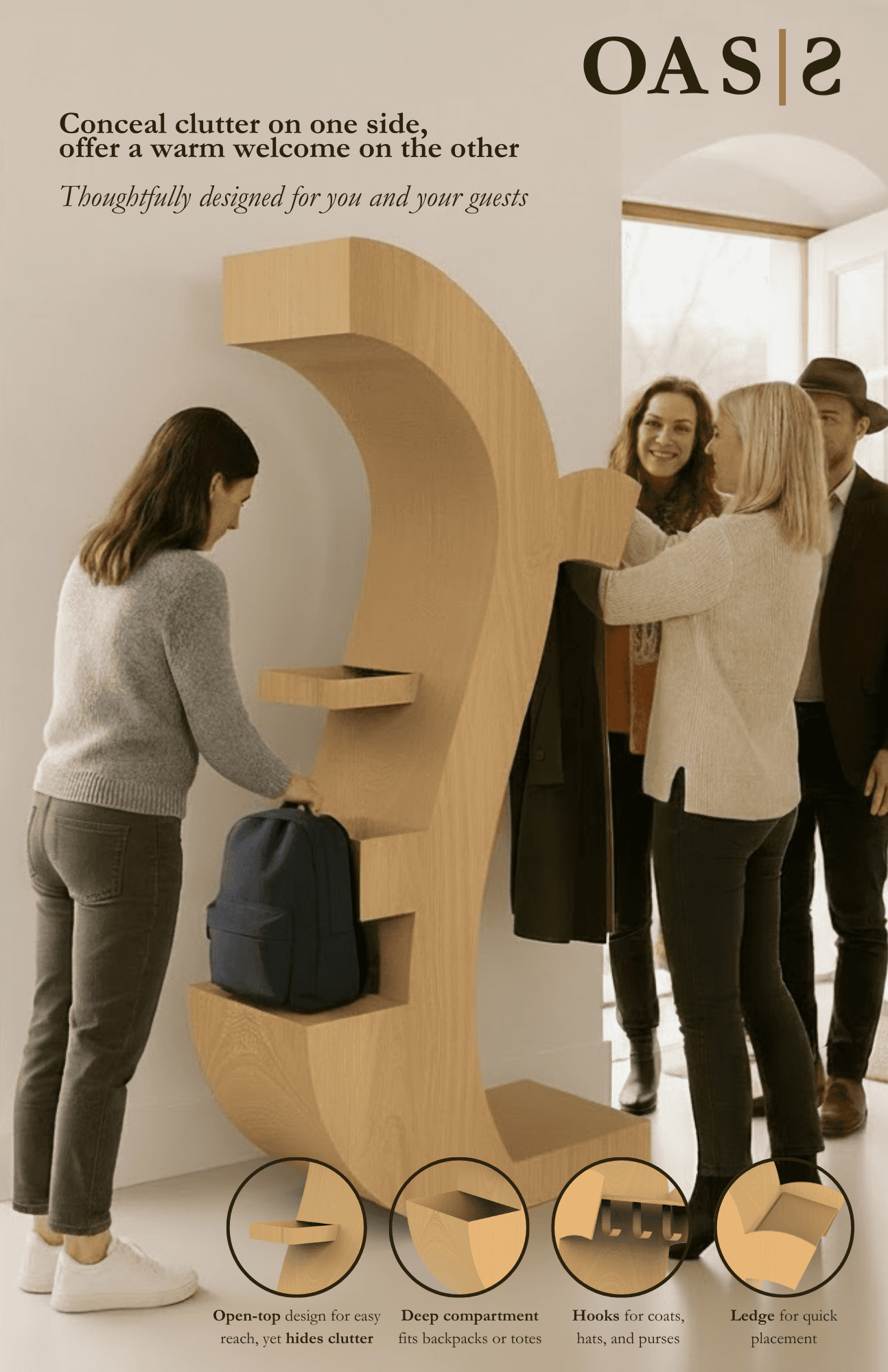
OASIS is a two-sided entryway furniture piece designed to support everyday spatial, emotional, and social transitions for both residents and guests.

Overview
Challenge
The challenge of this project was to design a socially engaged piece of furniture - specifically a sideboard / cabinet / console - that supports emotional, social, and functional transitions within living spaces.
Guided by the studio brief and inspired by the work of Sebastián Errázuriz, whose practice explores transformability, interaction, and emotional response in furniture, the project asked us to move beyond static storage objects and instead design furniture as an active participant in daily life.
Rather than treating a sideboard as a purely utilitarian object for storage or display, the challenge was to reimagine it as a social interface - one that mediates how people enter a space, interact with others, transition between roles, and emotionally reset throughout the day.
Solution
A survey from Homeaglow indicated that out of 1000 U.S. adults, over four fifths (82.50%) of adults feel guilt or shame when their home isn’t clean and half (50.1%) avoid inviting family or friends to their home because of this.
Designed for students and working professionals, OASIS is a dual-sided storage solution at the entryway of a home, where moments of arrival, departure, and hosting occur.
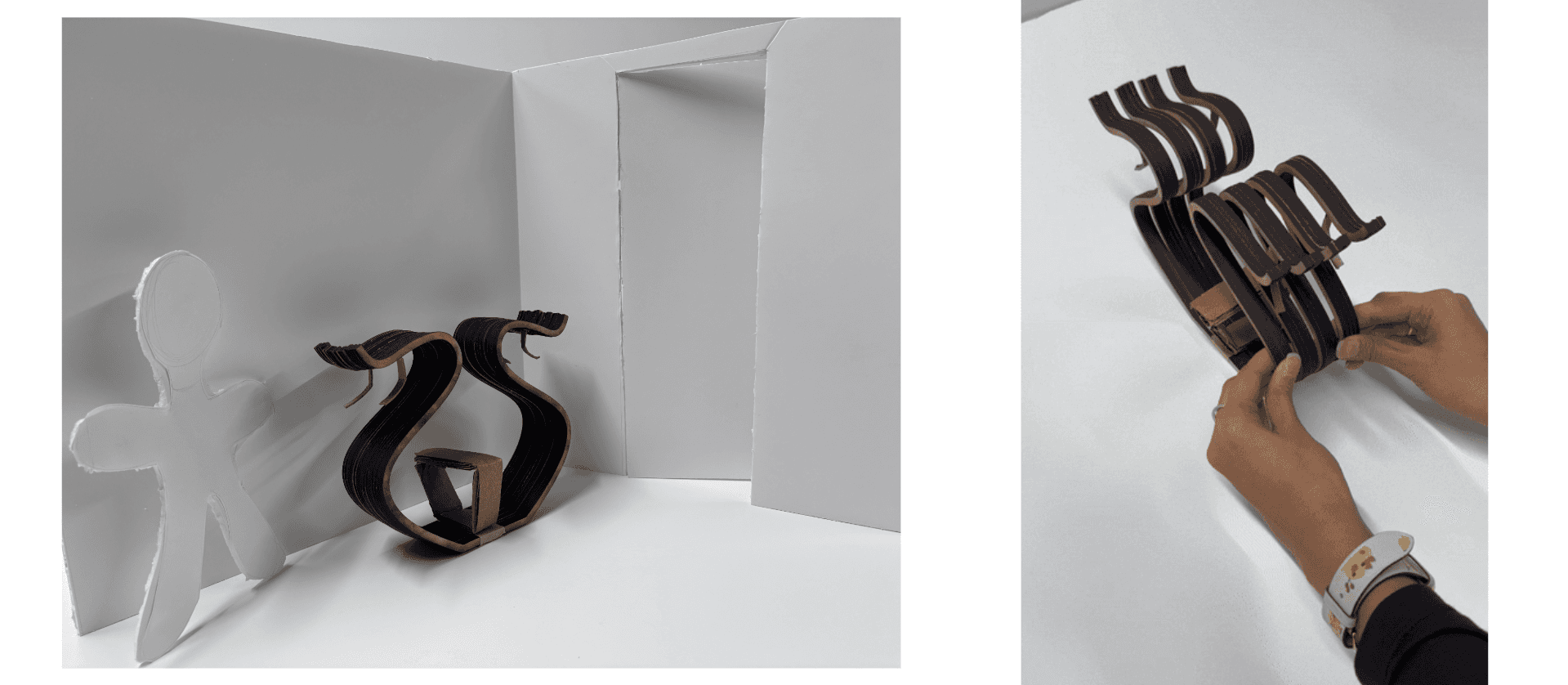
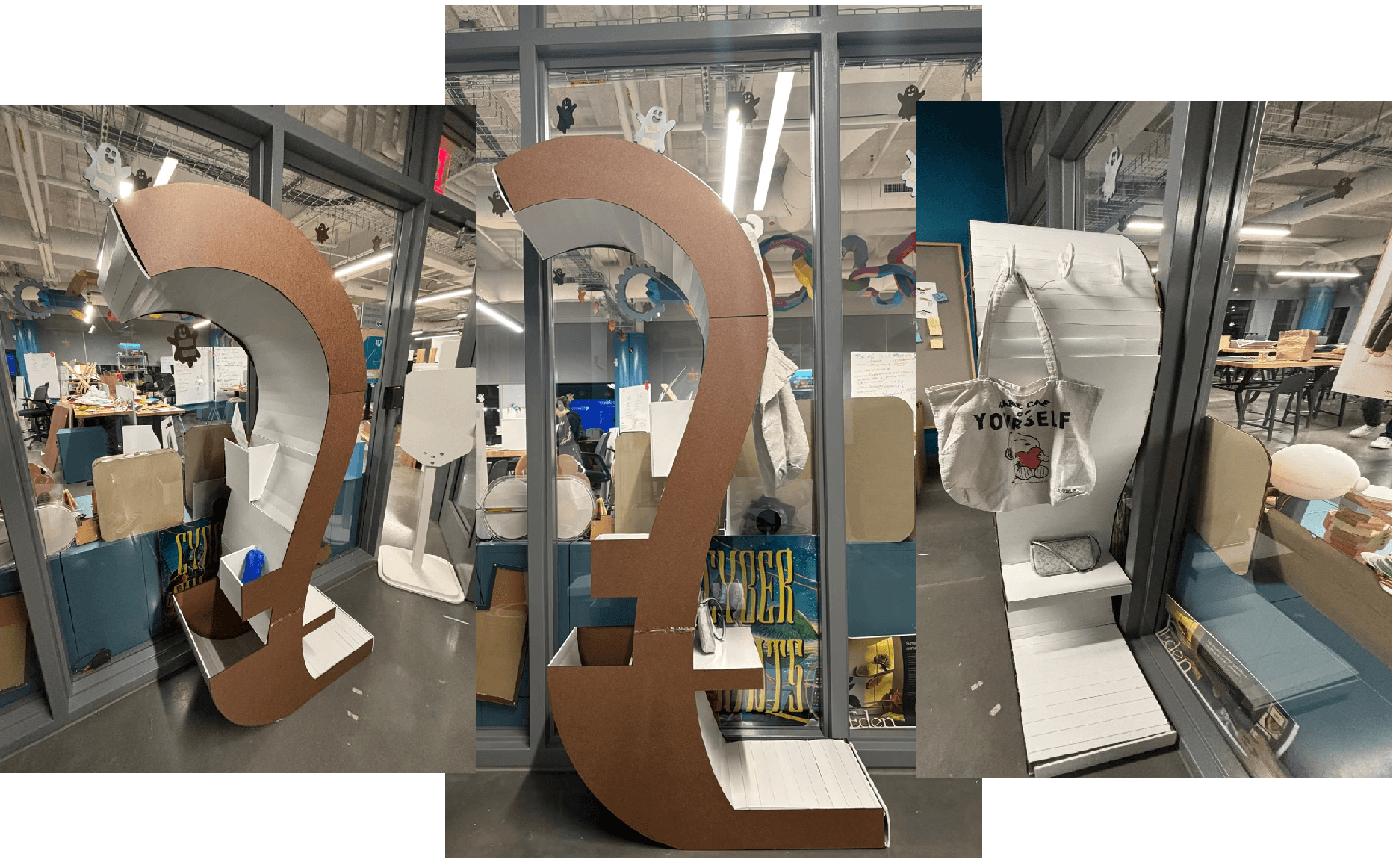
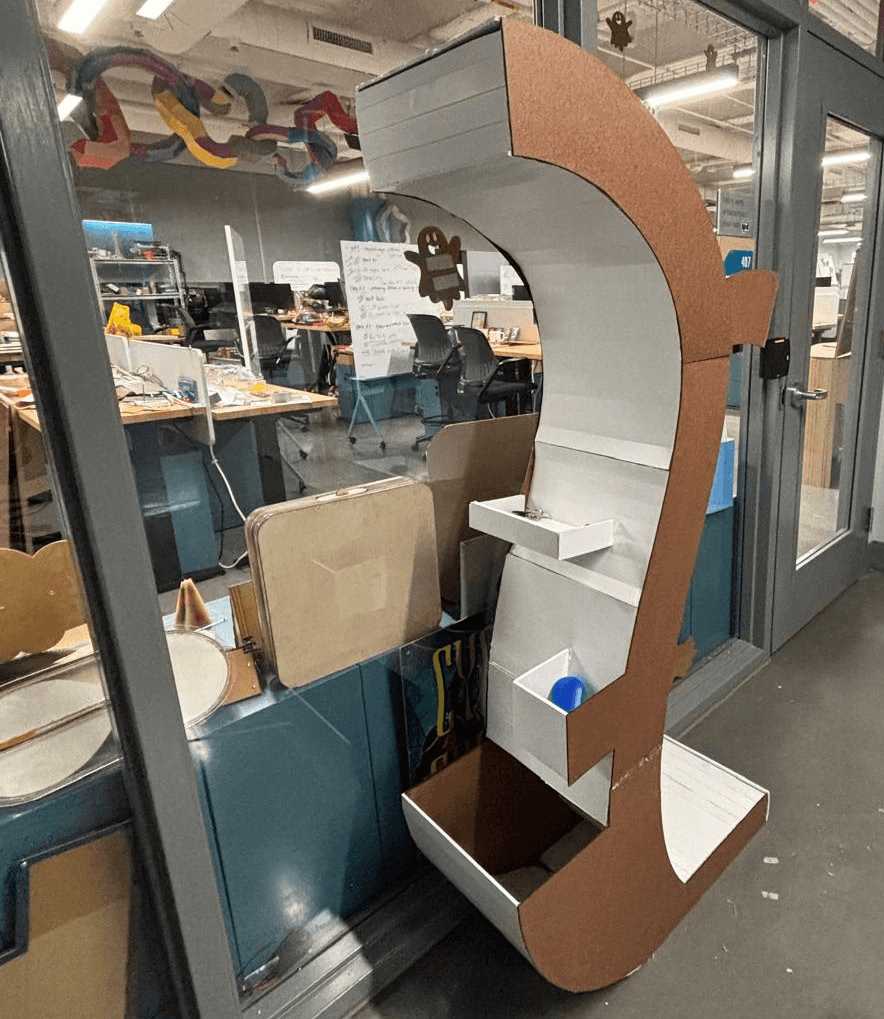
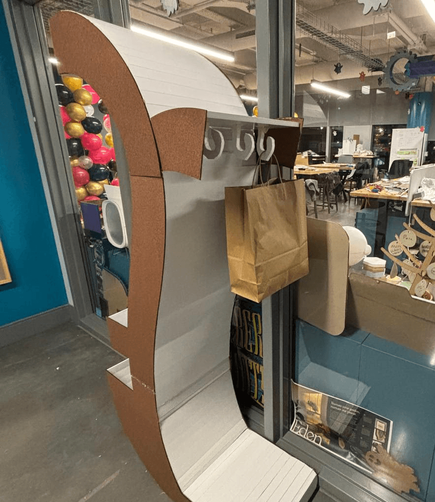
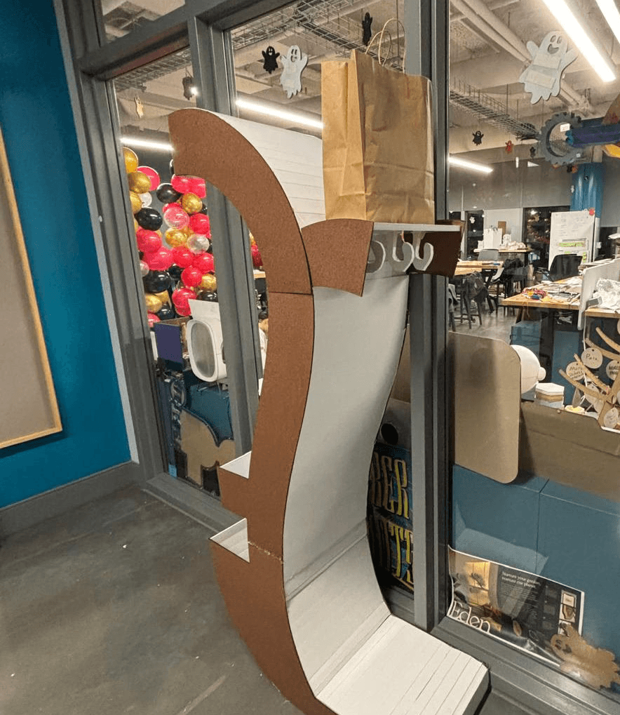
The piece is defined by a curved, vertical inverted S-shaped profile that maximizes storage capacity while maintaining a minimal footprint. Its form allows the piece to function as a spatial divider, separating resident-facing organization from guest-facing interaction without requiring walls or additional furniture.
One side of the piece is designed for the resident (storage that conceals clutter while remaining easily accessible during daily routines). This side includes:
A deep vertical compartment sized to hold backpacks, totes, or daily carry items
Open-top trays positioned for quick drop-off of keys, wallets, and small essentials
The opposite side is designed for guests. This side offers:
Exposed hooks for coats, hats, and purses
A shallow ledge for quick placement of items during social moments
An open, welcoming layout that visually signals hospitality and readiness for hosting
The piece's two-sided logic allows both users to interact with the same object simultaneously; residents can organize personal belongings while guests engage with visible, intuitive storage. This separation helps maintain a guest-ready environment without requiring last minute cleaning or rearranging.
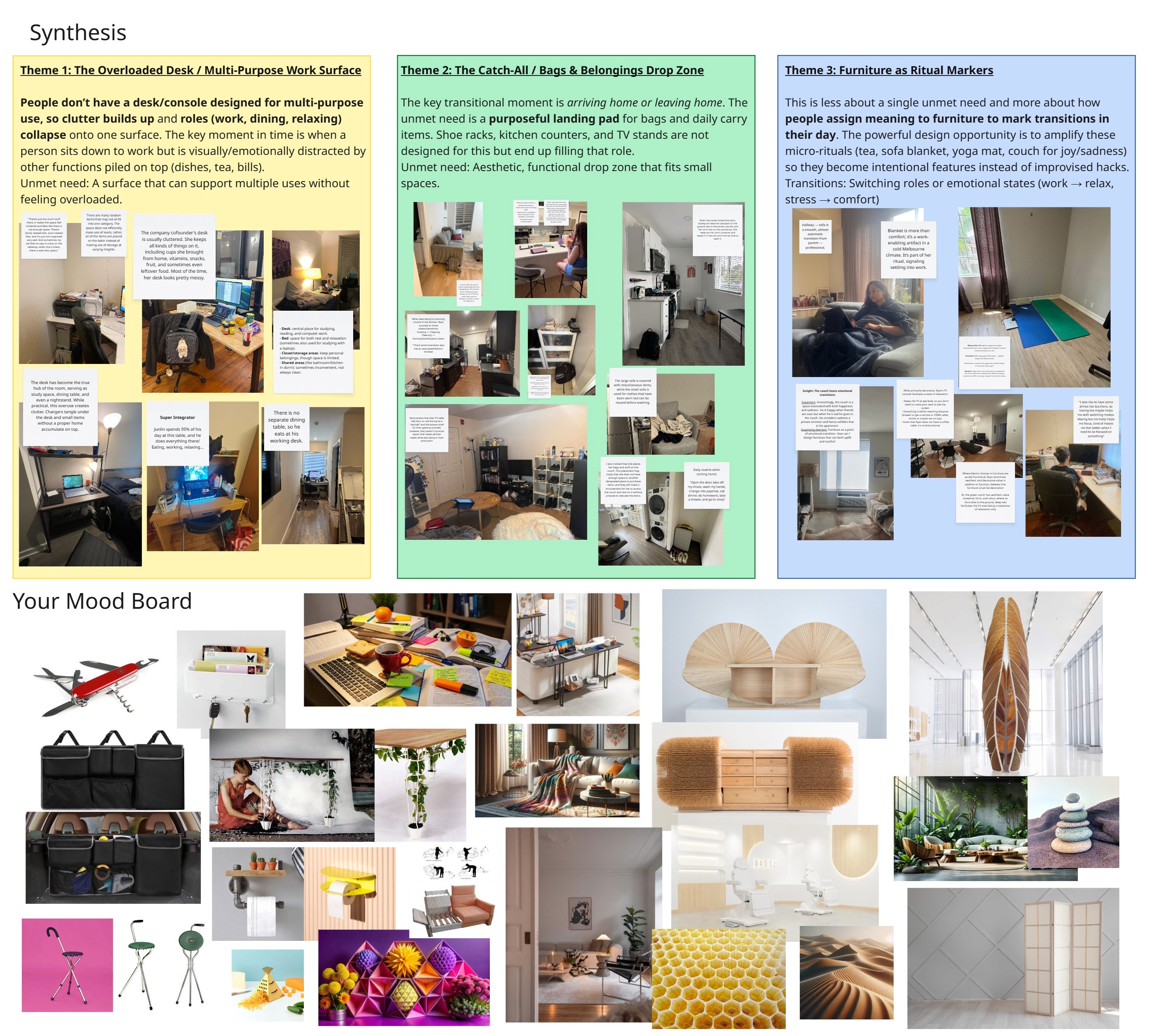
Research
After conducting 2 in-depth interviews and pooling group insights, I uncovered key user insights:
Threshold clutter spills onto food surfaces.
“I had rushed out since I was finishing work before so all my school stuff was still out…in the morning, my breakfast spot was a mess." - Liza’s friend
Backpack / keys / laptop have no default home.
“When she comes home from work, Audrey will leave her backpack on the ground next to the kitchen counter…” - Beatrice
Ad-hoc storage feels socially “wrong.”
“I know it's weird to store my bag there.” - Liza’s friend
People want tiered, multi-use catchalls but can’t find the right fit.
“Demi wishes that their TV table had tiers, to use the top as a ‘catchall’...” - Shereen
Thinking about the aesthetics of the furniture piece I wished to create, I put together a (divergent) mood board.
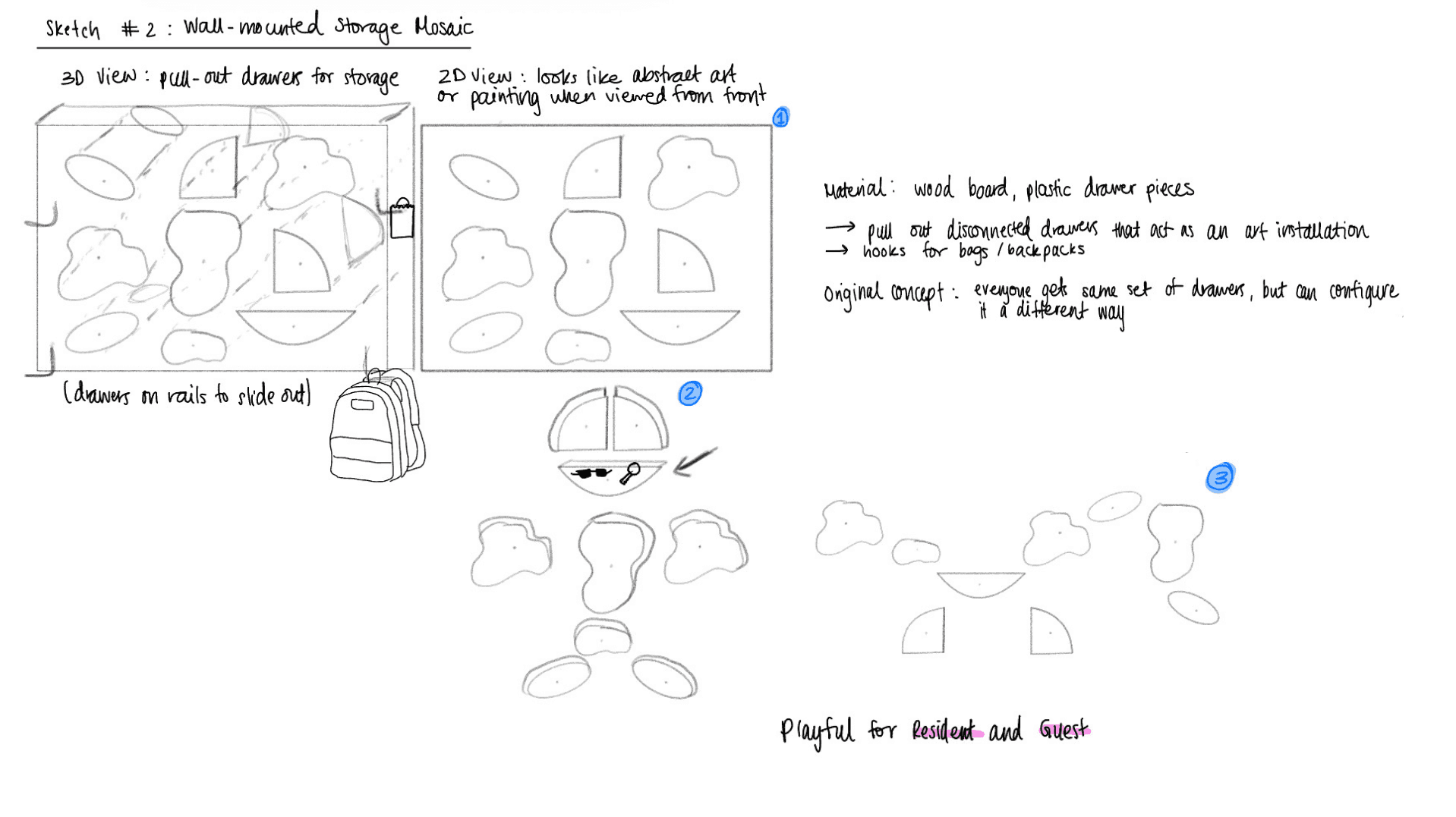
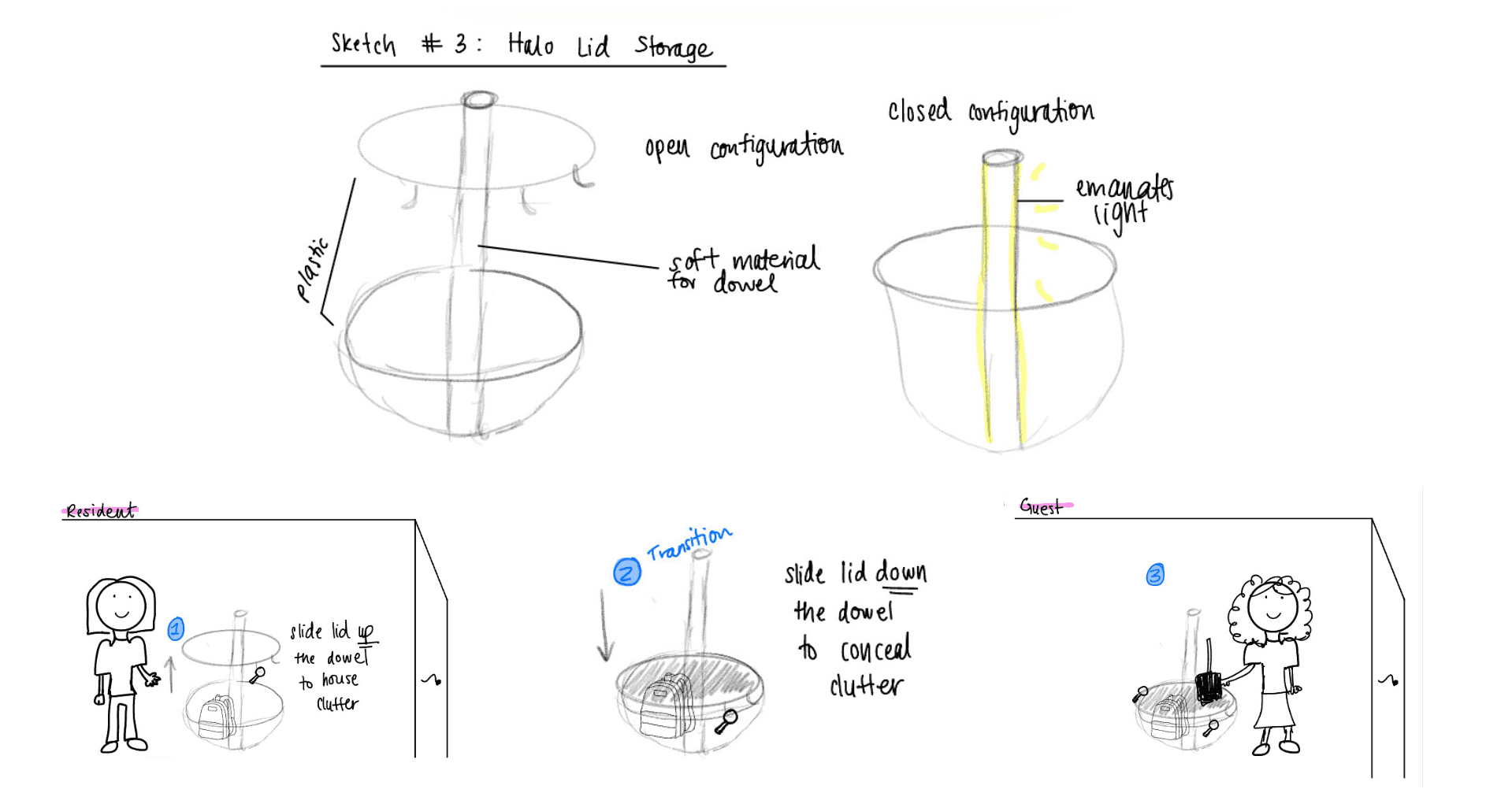
Initial Brainstorming & Sketching
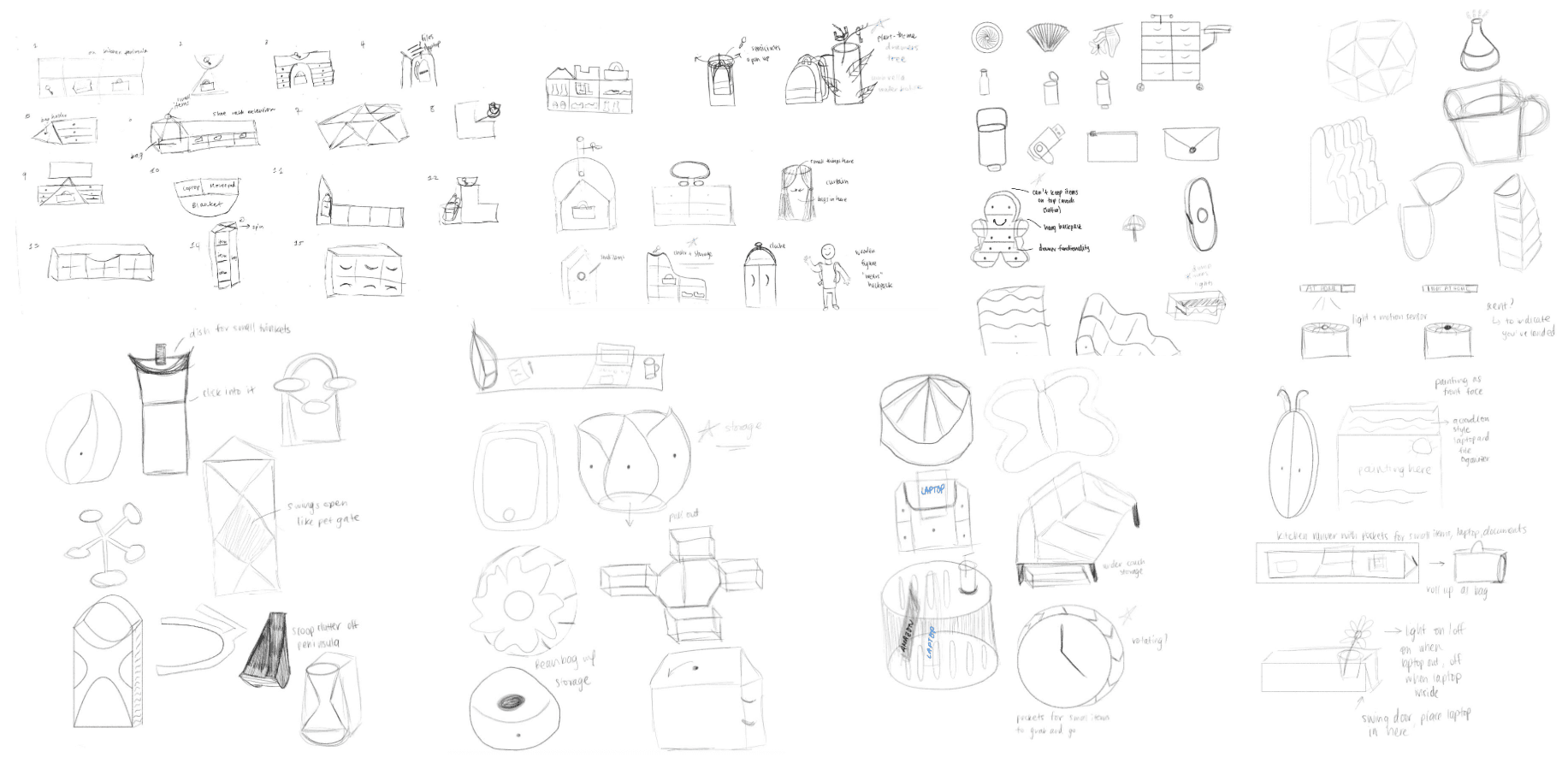
Concepts
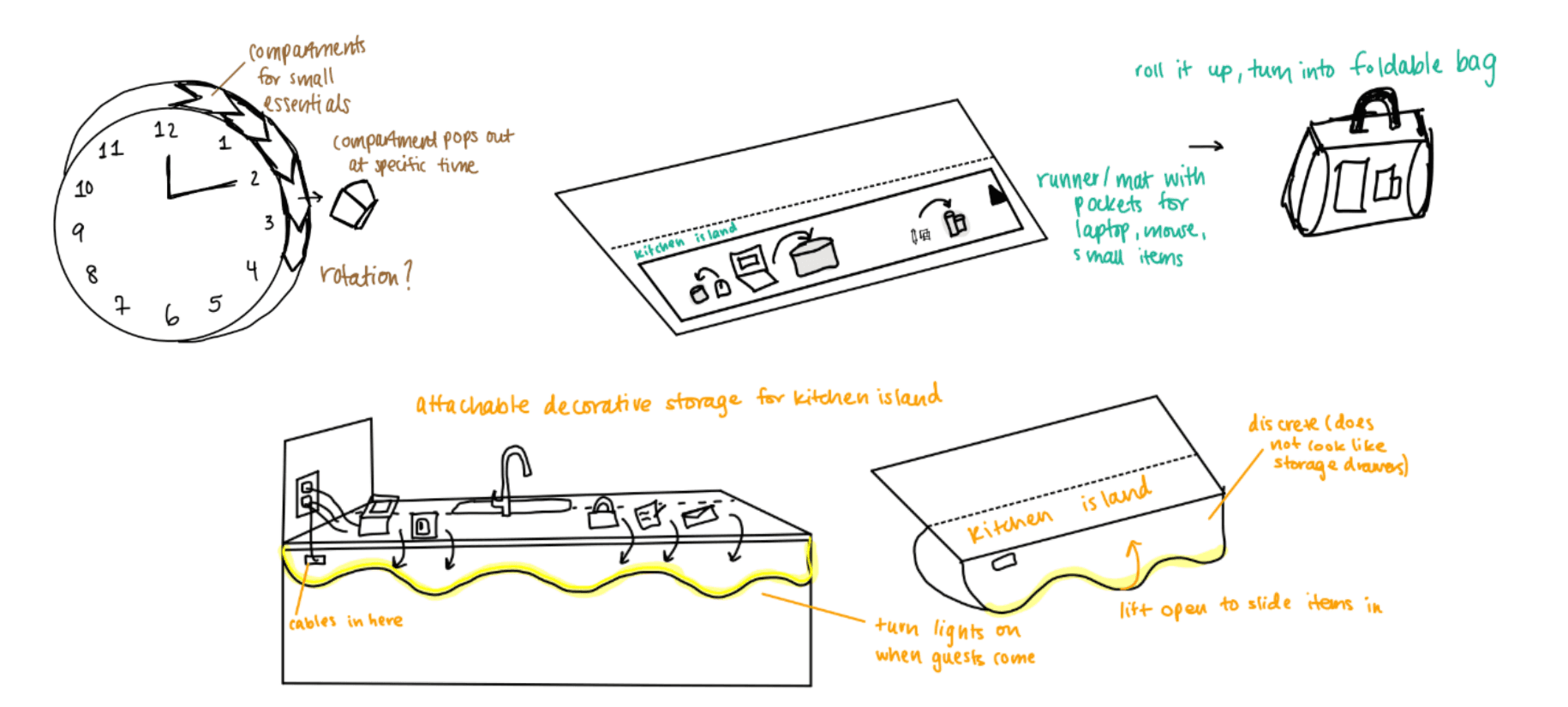
Theme 1: The Overloaded Desk / Multi-Purpose Work Surface
"Junlin spends 95% of his day at this table, and he does everything there! Eating, working, relaxing..."
Theme 2: The Catch-All / Bags & Belongings Drop Zone
Theme 3: Furniture as Ritual Markers
Design
I chose to center my designs around Theme 2 as I found it to be the most unique angle to take for this project.
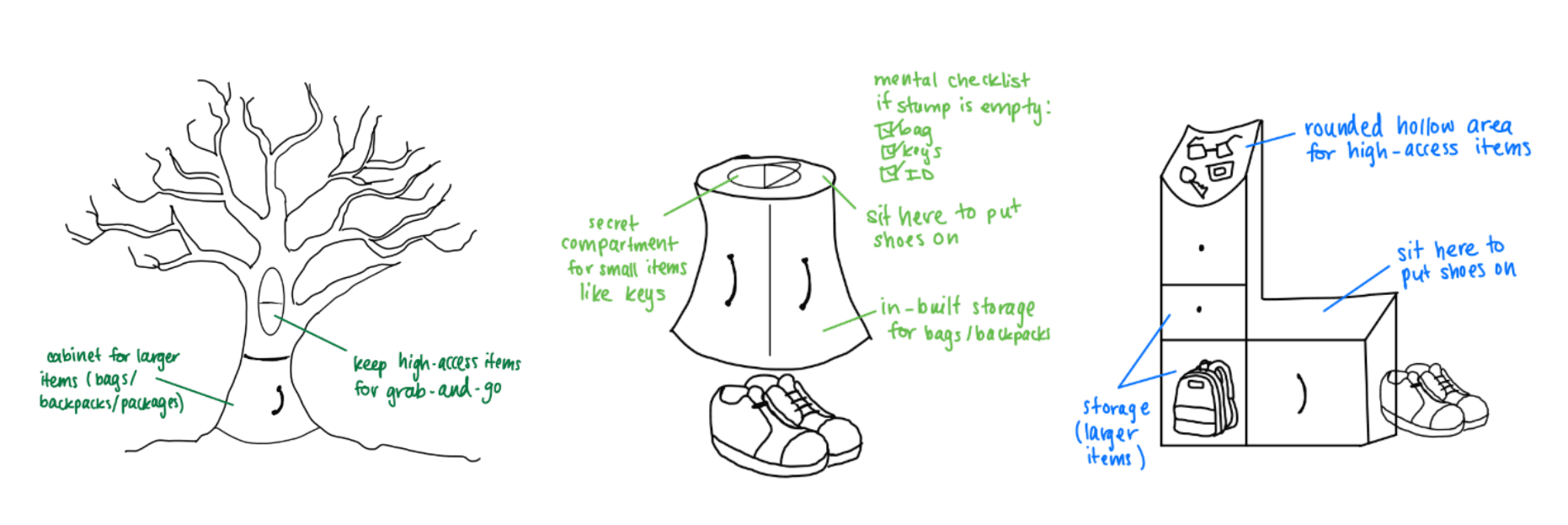
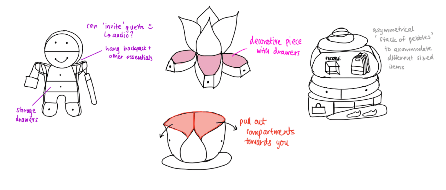
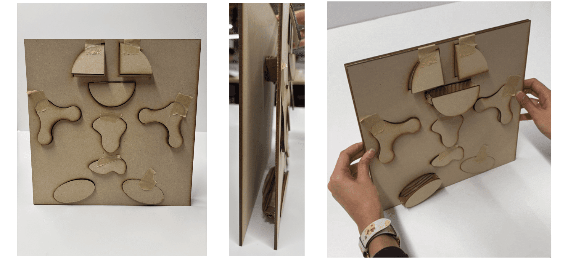
Exploratory Sketch Models
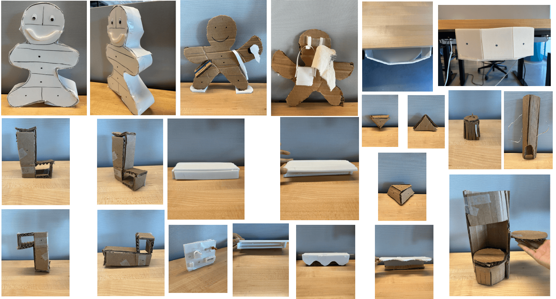
Focused Sketches and Models (click HERE to watch!)
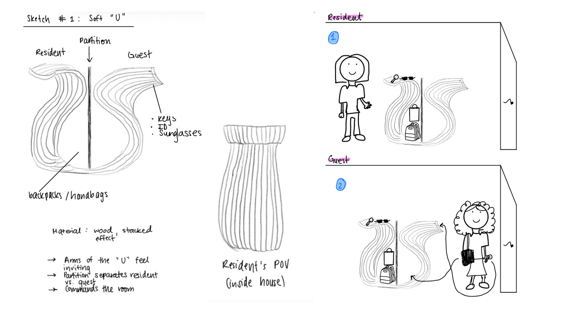
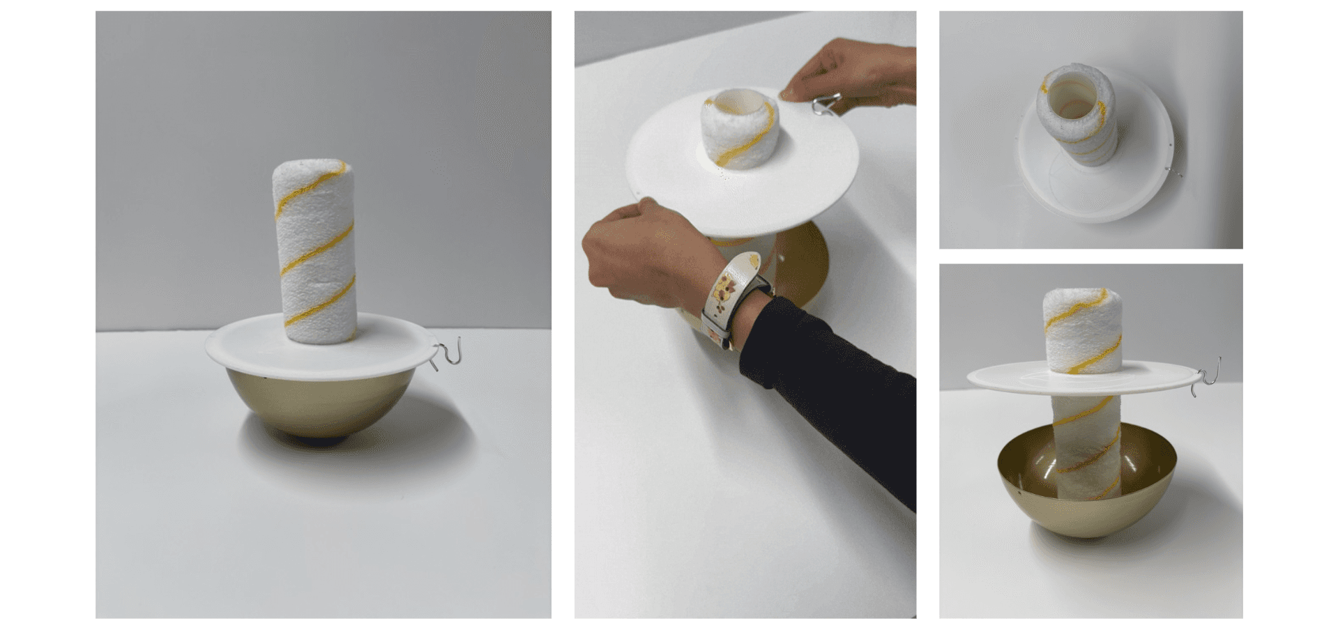
Feedback from peers and instructors suggested that The Soft "U" was the way to go:
U-form = instant emotional read (“a hug”) → keep the soft, welcoming curves and make the “embrace” feeling even more obvious from a distance.
Guest vs. resident split is the clearest usability win → exaggerate the separation with form/height cues so guests intuitively know where to place items.
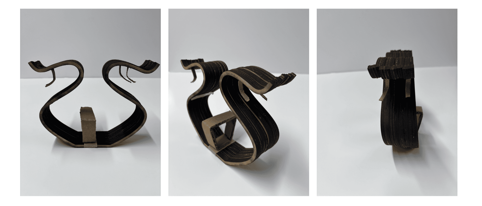
Iteration 1
User Testing
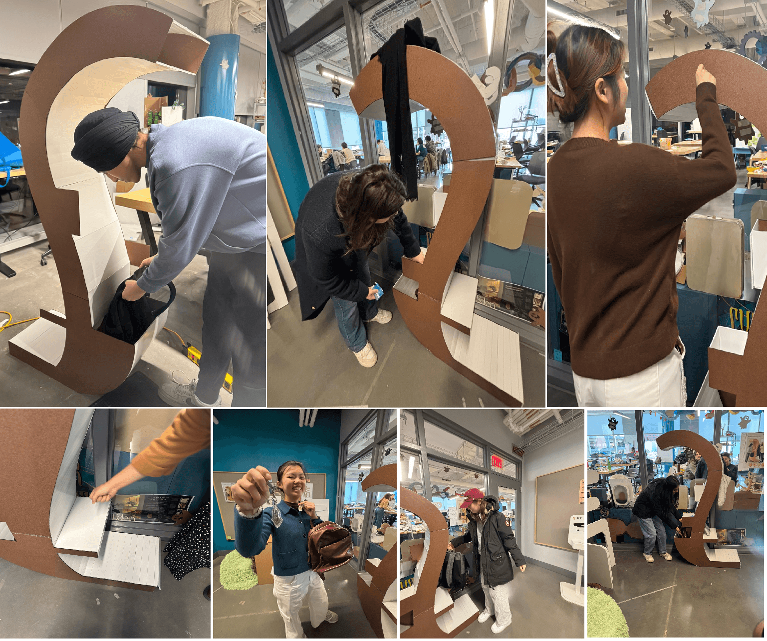
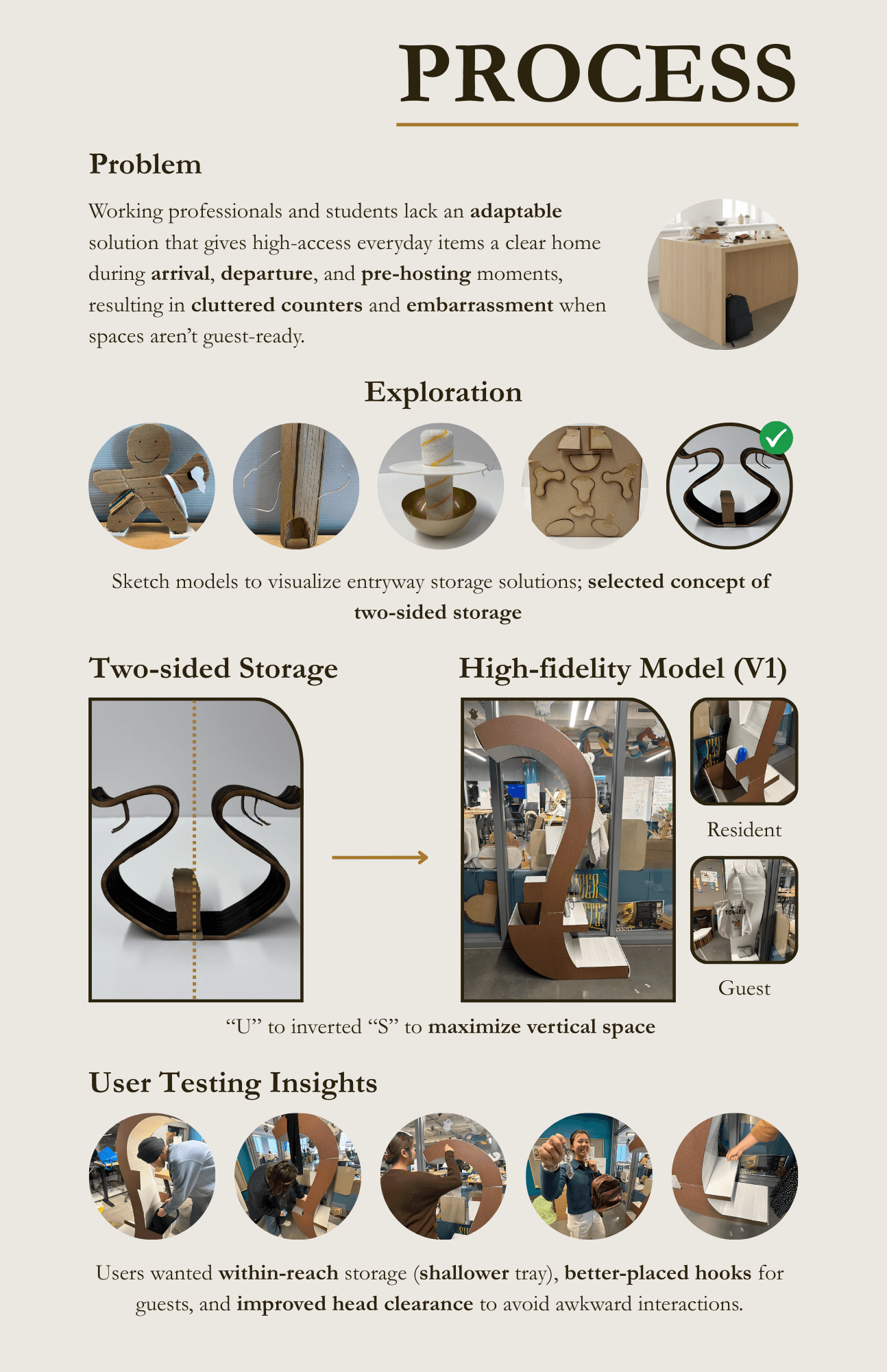
Results
To implement feedback from user testing, changes were made (cut part of the overhang, made the trays on the 'resident' side shallower, moved the ledge up and placed hooks under the ledge on the 'guest' side) and this was the final design and accompanying product poster:
 |
 |
 |
 |
 |


