Design
Redesigning Path@Penn
End-to-end UX redesign of Path@Penn’s course search to streamline registration and improve the student planning experience.

Overview
Challenge
The challenge of this project was to redesign the Path@Penn course search experience to better support how students find, evaluate, and register for courses - addressing rising help-desk requests caused by unclear navigation, fragmented information, and high-friction decision-making during registration.
Guided by the project brief and grounded in student user research, the challenge required moving beyond surface-level interface changes to understand how students actually plan their schedules, detect conflicts, and interpret registration status under time pressure.
Instead of viewing Path@Penn as a collection of disconnected features, the challenge was to reimagine it as a cohesive academic planning tool - one that centralizes scheduling context, prioritizes essential information, and reduces cognitive load so students can move from exploration to registration with fewer errors and less confusion.
Solution
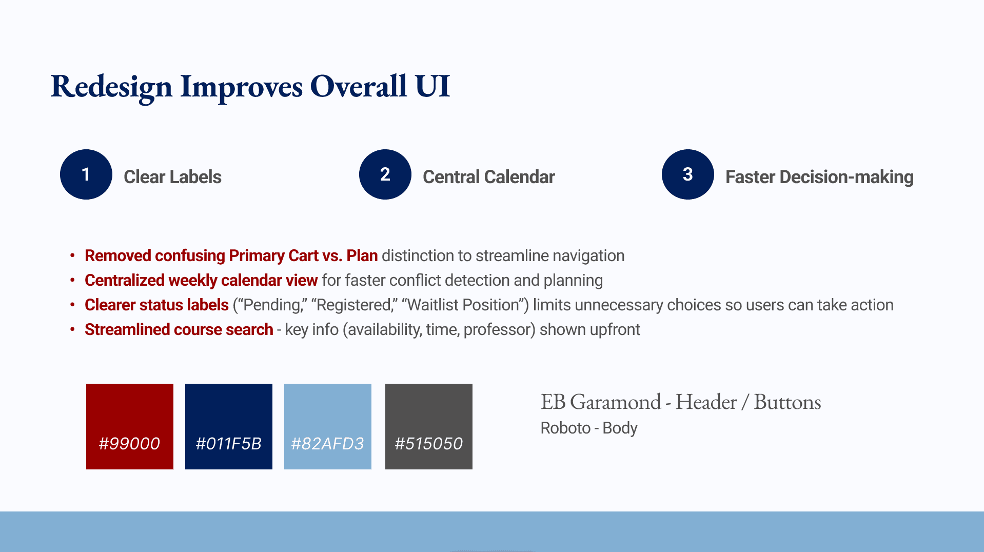
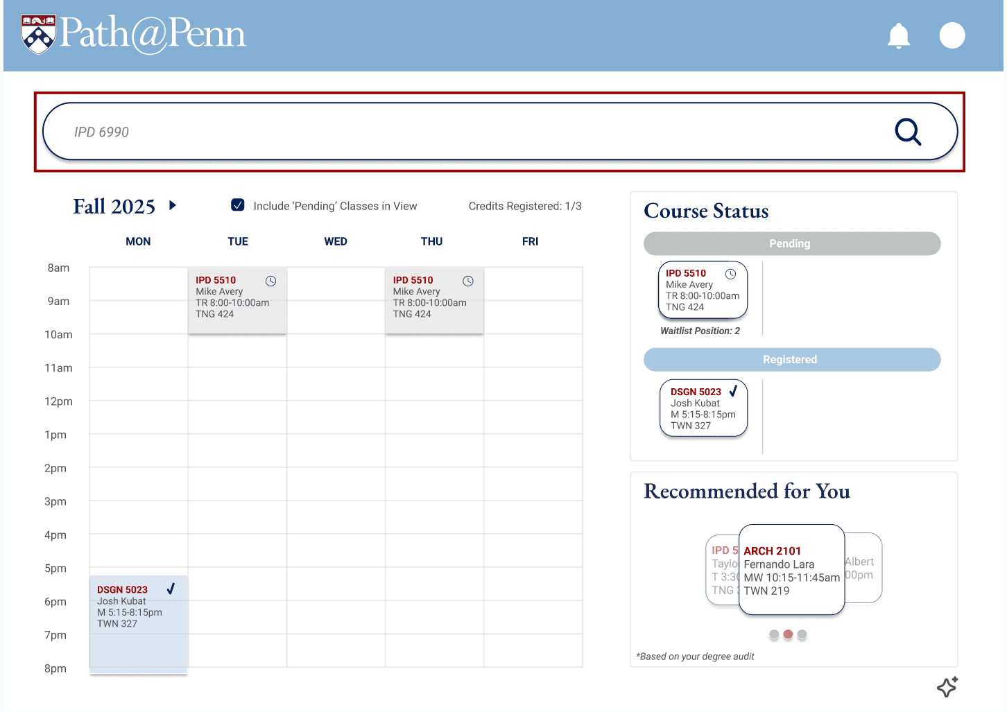
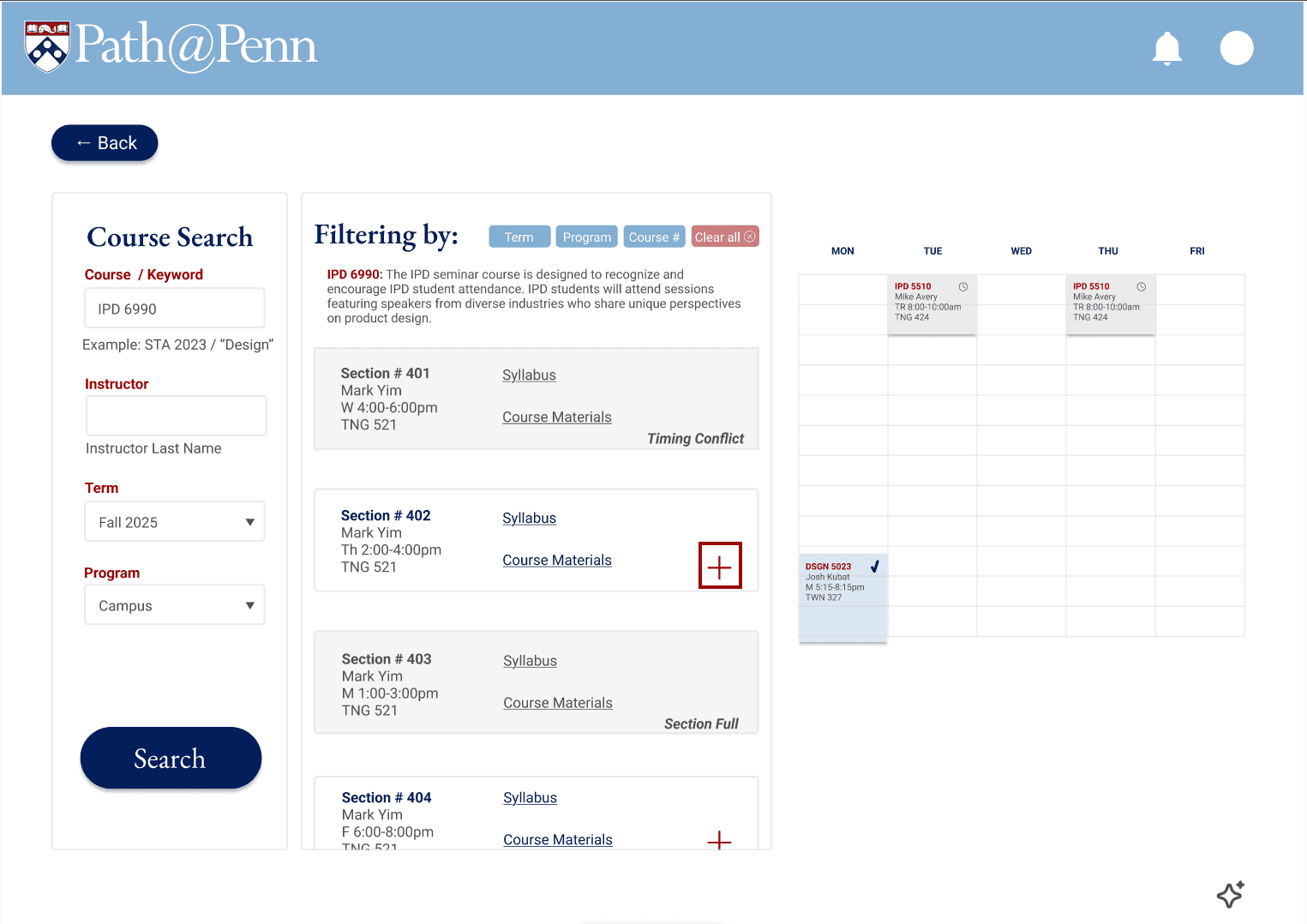
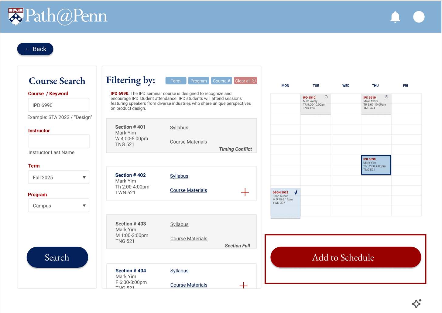
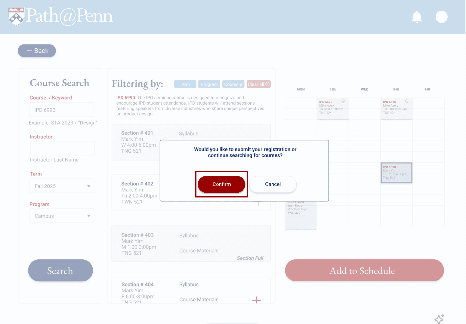
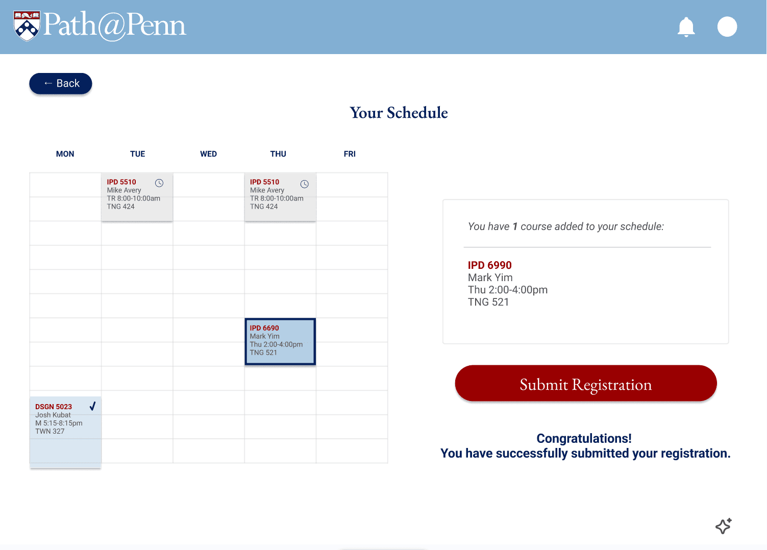
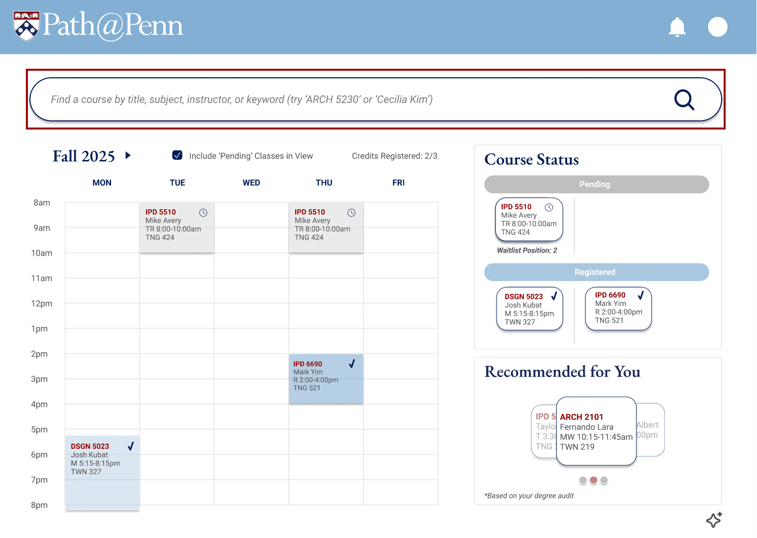
Designed for Penn students registering under time pressure, the solution prioritizes search and scheduling context through a streamlined landing page, a centralized weekly calendar for instant conflict detection, and search results that surface key details upfront (availability, time, instructor).
The redesign also removes the confusing “Primary Cart vs. Plan” distinction and replaces it with clearer, action-oriented status labels (“Pending,” “Registered,” “Waitlist Position”), and a confirmation step to prevent accidental registration. Together, these changes reduce cognitive load, limit unnecessary choices, and make the path from discovery to registration faster and more intuitive.
Research
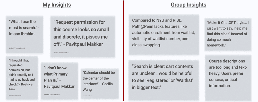
Conducted 4 structured user interviews with task-based flows and synthesized findings into evidence-backed themes and “How Might We” statements.
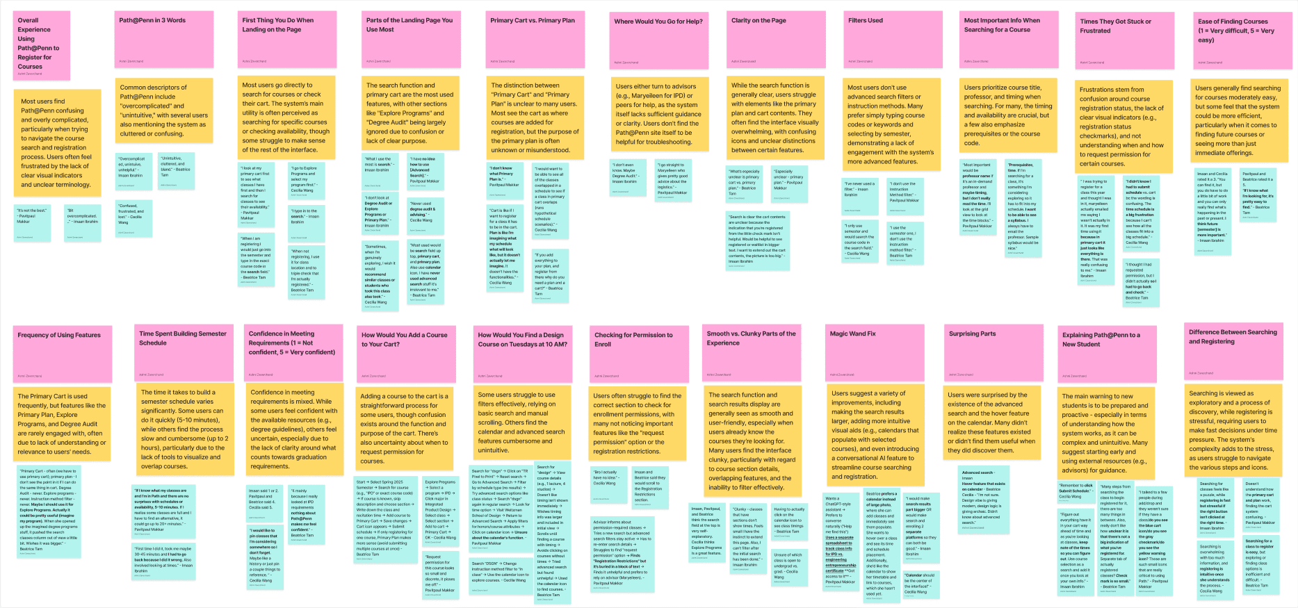
Overwhelming Choices
The user has limited time and too many options to choose from during the course search and registration process.
Lack of Clarity
Visual Clutter
Design
Brainstorming and Sketches
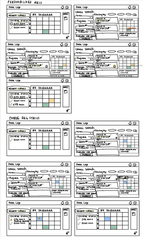
Low-fidelity Wireframes
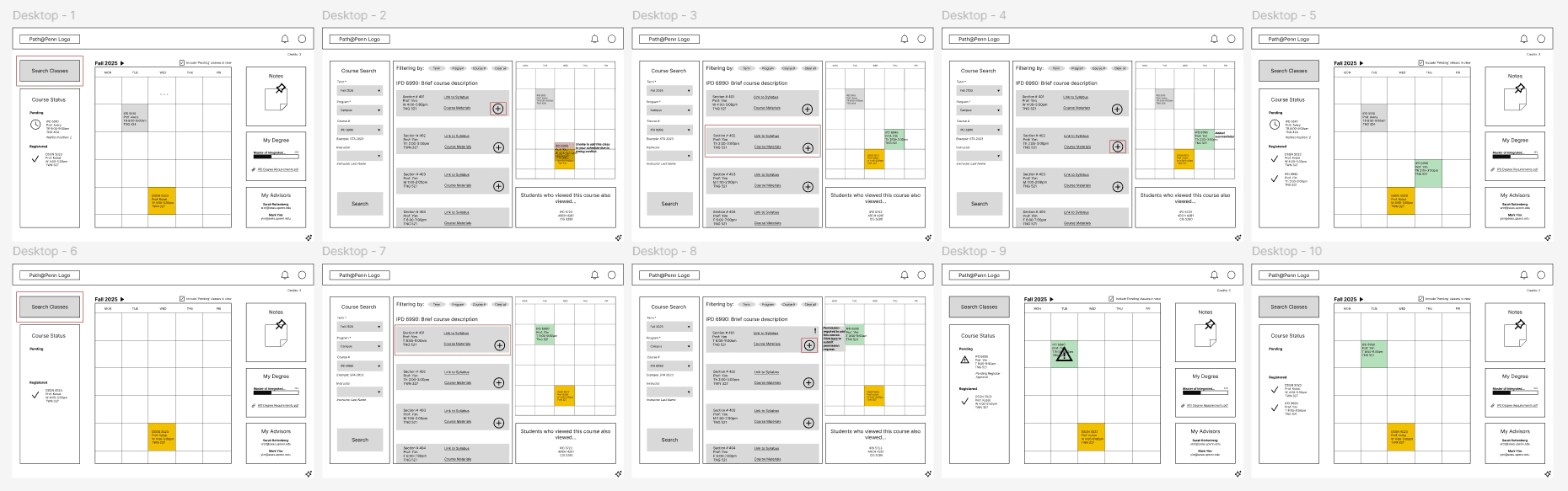
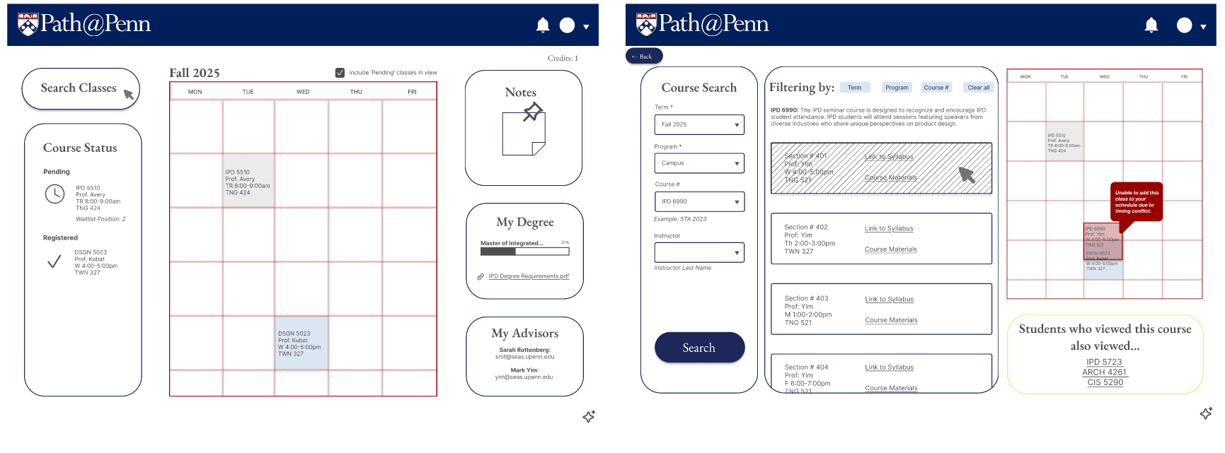
High-fidelity Design (V1)
User Testing
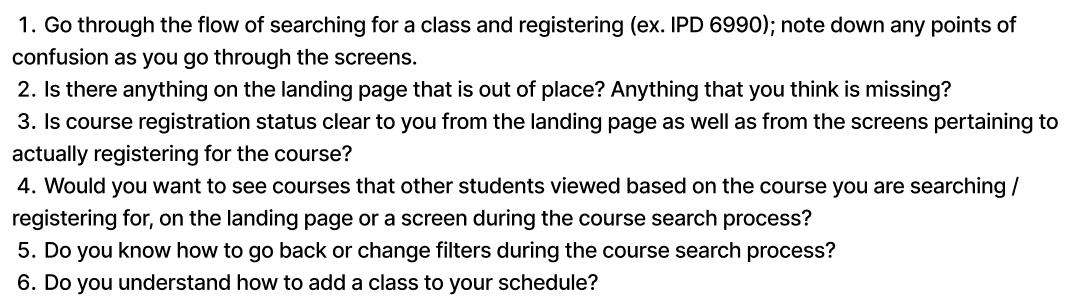
I completed usability testing with 4 users on the above high-fidelity desktop screen designs, identifying feature misalignment and flow friction in V1.
Results
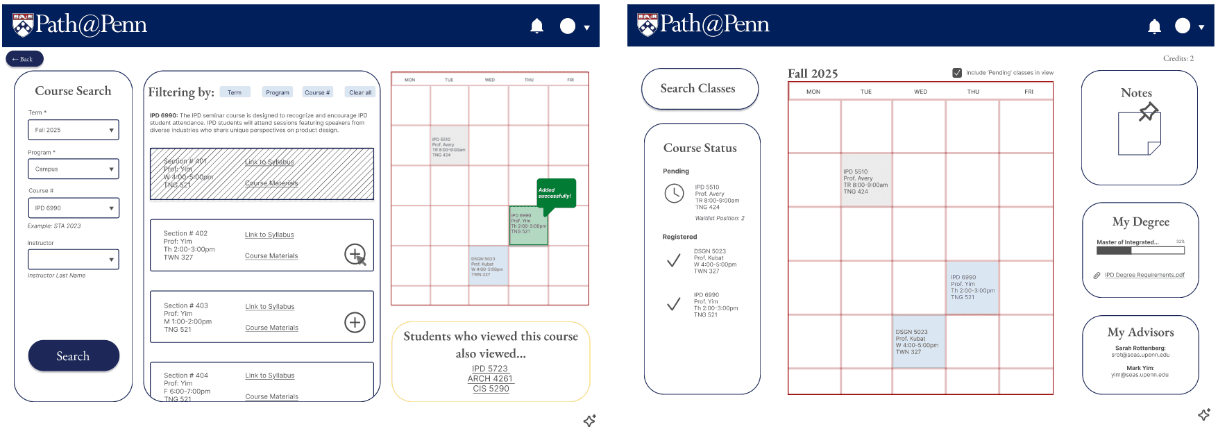
The final high-fidelity design (V2) can be seen below:
 |  |  |
 |  |  |
 |
|---|